
Responsive Website Redesign
We conducted detailed research to understand the website audience. During this process, we enquired about the enrollment procedure, content needs, and other key aspects of the website to understand the larger picture. Since, our design relied on the websites’ user experience, understanding the audience and process was vital to website development process.
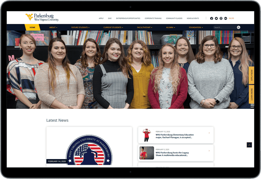
Upon understanding the requirements, our UX team designed an information architecture keeping at the center the primary goal of the website. The website content and navigation structure were reorganized to eliminate redundant steps, complete the process in minimal clicks and make the website a lot more intuitive. Also, modern page templates and interactive elements like multimedia content and social media plugins were added to better engage with the audience.
To match the current user needs, our team ensured a mobile responsive design to ensure that users can seamlessly open the website on any device seamlessly. Once the development was complete, our testers conducted thorough usability testing to ensure users can effortlessly interact with the website and access the information.
Interactivity & Analytics
We also incorporated intuitive call to action to multiply the lead conversion and tracked them on the CRM to understand the user journey on the website. Our experts integrated website with the google analytics to continuously monitor the website’s performance and fine-tune it as per the received insight. We also incorporated intuitive call to action and integrated it with analytics code to understand the user journey on the website. With analytics, we easily monitored the website’s performance and ironed out the issues proactively with constant insights.
PROJECT DETAILS